Advertisements, and InfoGraphics:
Advertising or advertising in business is a form of marketing communication used to encourage, persuade, or manipulate an audience (viewers, readers or listeners; sometimes a specific group) to take or continue to take some action. Most commonly, the desired result is to drive consumer behaviour with respect to a commercial offering, although political and ideological advertising is also common. This type of work belongs to a category called affective labour.
InfoGraphics:
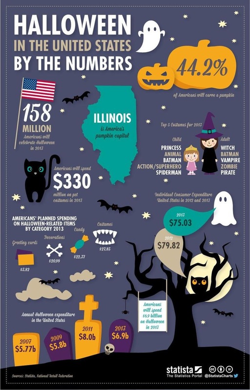
People who create infographics do their work partly because they believe that infographics are a great way to communicate the information. Since the people in this field also need to communicate information about their work, it was inevitable that infographics about infographics would eventually be created.
Information graphics or infographics are graphic visual representations of information, data or knowledge intended to present complex information quickly and clearly. They can improve cognition by utilizing graphics to enhance the human visual system’s ability to see patterns and trends. The process of creating infographics can be referred to as data visualization, information design, or information architecture
History:
Infographics have been around for many years and recently the proliferation of a number of easy-to-use, free tools have made the creation of infographics available to a large segment of the population. Social media sites such as Facebook and Twitter have also allowed for individual infographics to be spread among many people around the world. In newspapers, infographics are commonly used to show the weather, as well as maps, site plans, and graphs for statistical data. Some books are almost entirely made up of information graphics, such as David Macaulay's The Way Things Work. The Snapshots in USA Today are also an example of simple infographics used to convey news and current events.
Modern maps, especially route maps for transit systems, use infographic techniques to integrate a variety of information, such as the conceptual layout of the transit network, transfer points, and local landmarks. Public transportation maps, such as those for the Washington Metro and the London Underground, are well-known infographics. Public places such as transit terminals usually have some sort of integrated "signage system" with standardized icons and stylized maps.
In his 1983 'landmark book' The Visual Display of Quantitative Information, Edward Tufte defines 'graphical displays' in the following passage:
"Graphical displays should:
Show the data
Induce the viewer to think about the substance rather than about methodology, graphic design, the technology of graphic production or something else
Avoid distorting what the data have to say
Present many numbers in a small space
Make large data sets coherent
Encourage the eye to compare different pieces of data
Reveal the data at several levels of detail, from a broad overview to the fine structure.
Serve a reasonably clear purpose: description, exploration, tabulation or decoration.
Be closely integrated with the statistical and verbal descriptions of a data set.
Graphics reveal data. Indeed graphics can be more precise and revealing than conventional statistical computations."
While contemporary infographics often deal with 'qualitative' or soft subjects, generally speaking Tufte's 1983 definition still speaks, in a broad sense, to what infographics are, and what they do—which is to condense large amounts of information into a form where it will be more easily absorbed by the reader.